Showing posts with label logo. Show all posts

Monday, September 2, 2013

Catching up

Here's a bunch of stuff I've made that I've been meaning to upload. In no particular order:

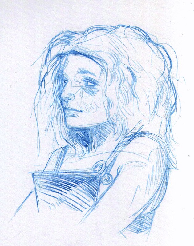
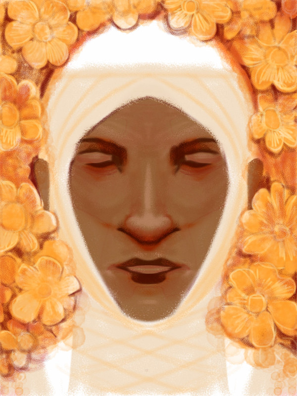
A couple faces made when trying out drawing into my iPad:
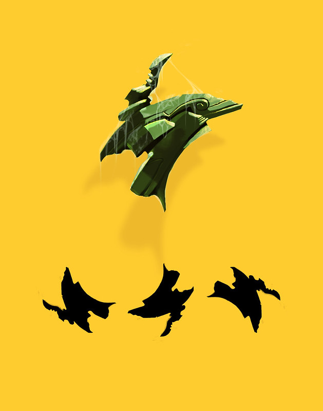
A random object I made as an exercise. I made the black outline shape first as a scribble. Then I carved into it with the eraser tool, and rotated it a few times to help see the possibilities. Then I finished it as a solid, describing the interior features:
A preliminary sketch for something still in progress:

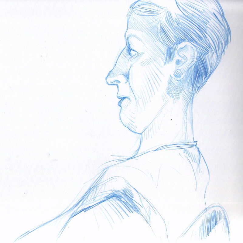
Some sketches and gestural stuff from attending the monthly Dr.Sketchy's life drawing sessions. I sometimes draw the model, and sometimes draw the other people attending:

Other model stuff:

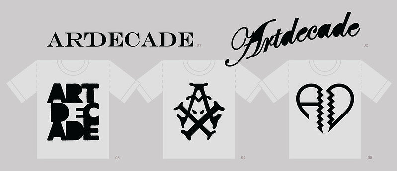
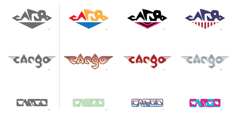
Some logo stuff for friends:
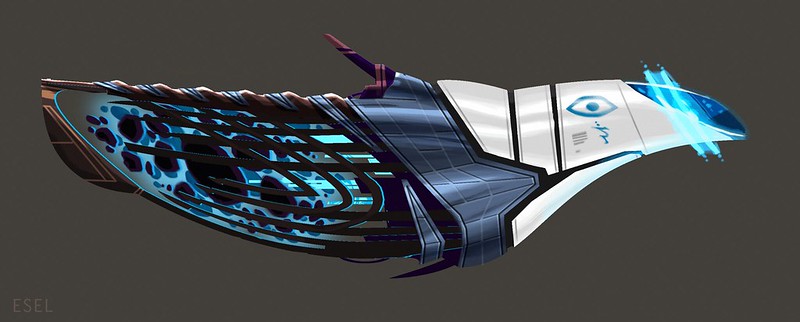
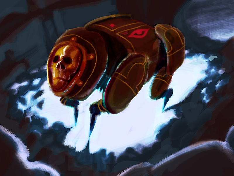
A spaceship, meant for an alien witch! So it's sort of a mix of a broomstick and a shuttlecraft:
A 30-min sketch of The Masque of The Red Death:

Another 30-min sketch for a robot thing:
I was commissioned to make a custom bookcover for a Kickstarter project, the person who gave a enough money to qualify received an image of their choosing (so this isn't my imagery/character design, etc):
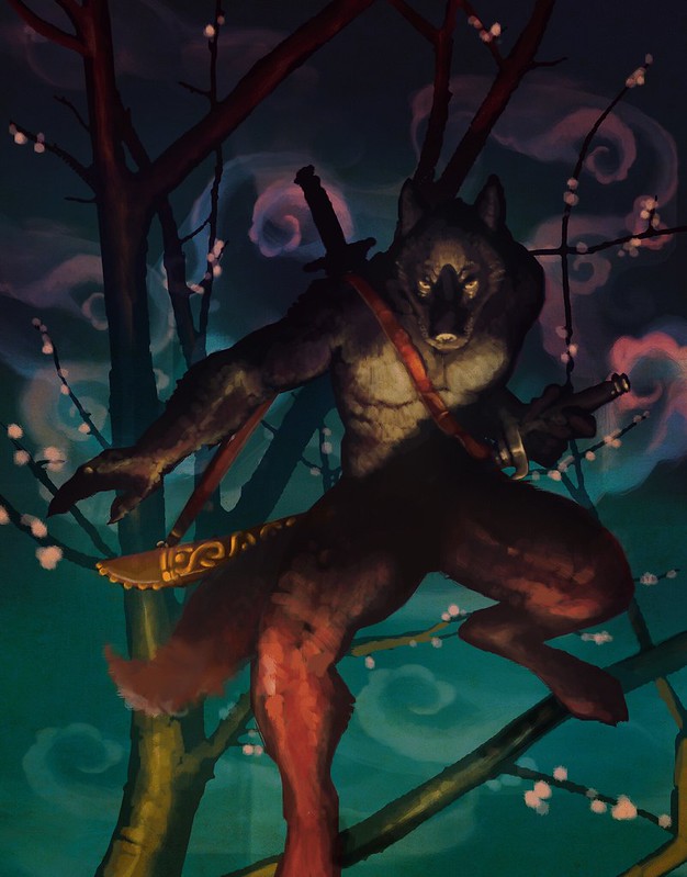
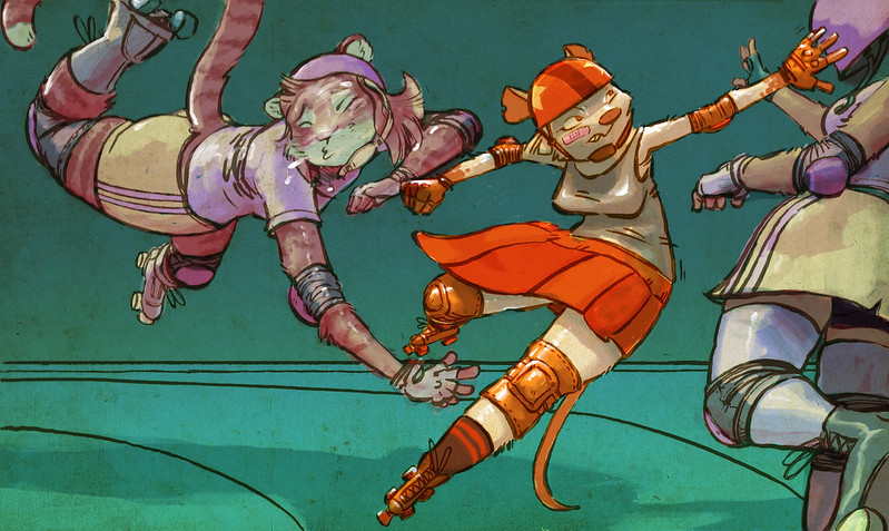
And some furry stuff, made as illustrations for a convention booklet:

Saturday, June 4, 2011

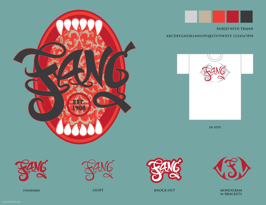
"Fang"


digital.

some logo design work for commission.

not actually established in 1908, that was just to show the logo in use for something :)

i've been getting into bicycle repair, so the imagery was in my head to make it into a bicycle badge, because they are typically awesome.

Tuesday, March 10, 2009

"Naked Space"

I was recently hired to design a logo for a client that runs a naked yoga studio in NYC called Naked Space. This is pretty much what it sounds like. He wanted something other than the logo he had, which he designed himself and looked like this. I did not alter it in any way other than to convert it to vectors.


He suggested maybe incorporating a yin-yang thing and/or showing somebody seated in a lotus position.

Based on his current logo, I could see that he'd be open to very stylized looks, so I came up with a few different design ideas:

  • A drawn solution:


  • One using the N (from "naked") as part of a yin-yang'ish symbol.


  • A "stickfigure" solution that I wanted to evoke both the seated position and a lotus flower.


    I sent him the designs and he seemed enthusiastic about it. Inspired, he worked more on the project of updating his logo himself, and sent me a sheet of designs he'd come up with based around fitting the current logo figure into the "Golden Ratio" rectangle. He couldn't decide which one to go with and so I picked the one most different from his current logo, but still in keeping with his new design goal. Here is my final submitted design that he approved.


    He paid me for my work, but I see on his site that he has tweaked it further still.

    NOTE: the website is quite tasteful and presents a respectable business, but there is mild nudity. You can see the design in place here.

    He also used the logotype I submitted, and it is a handsome font to be sure.