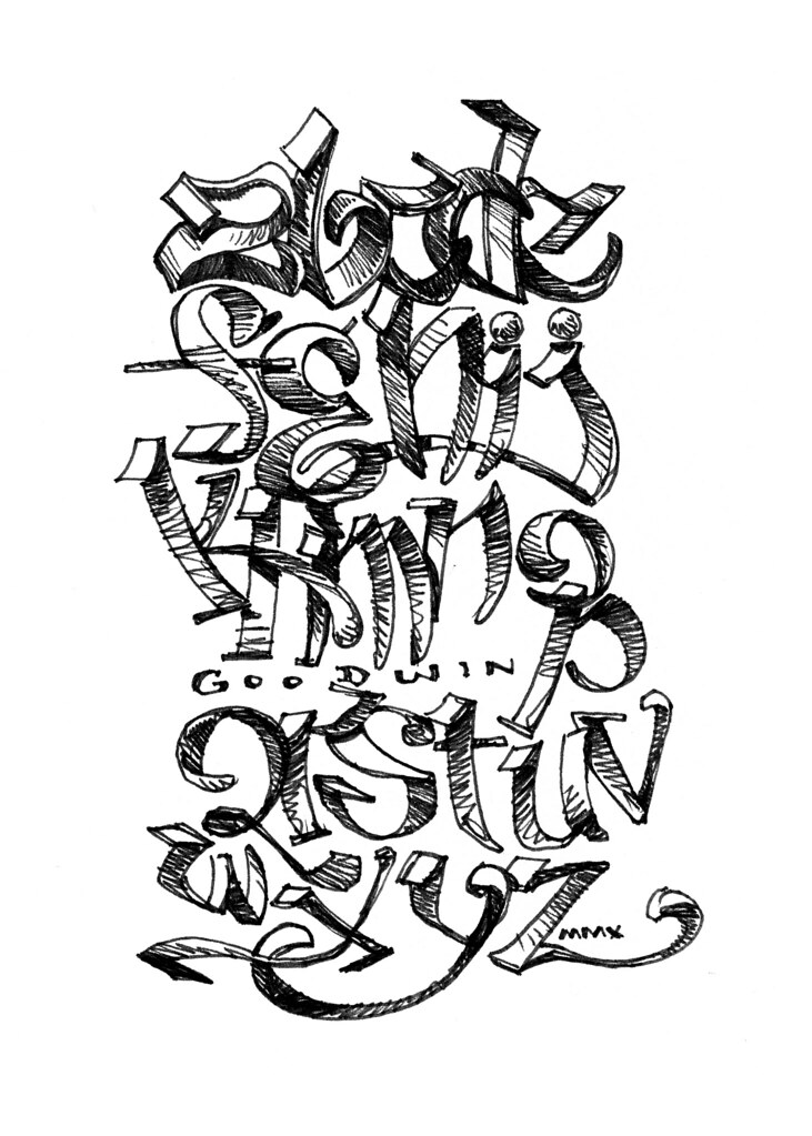
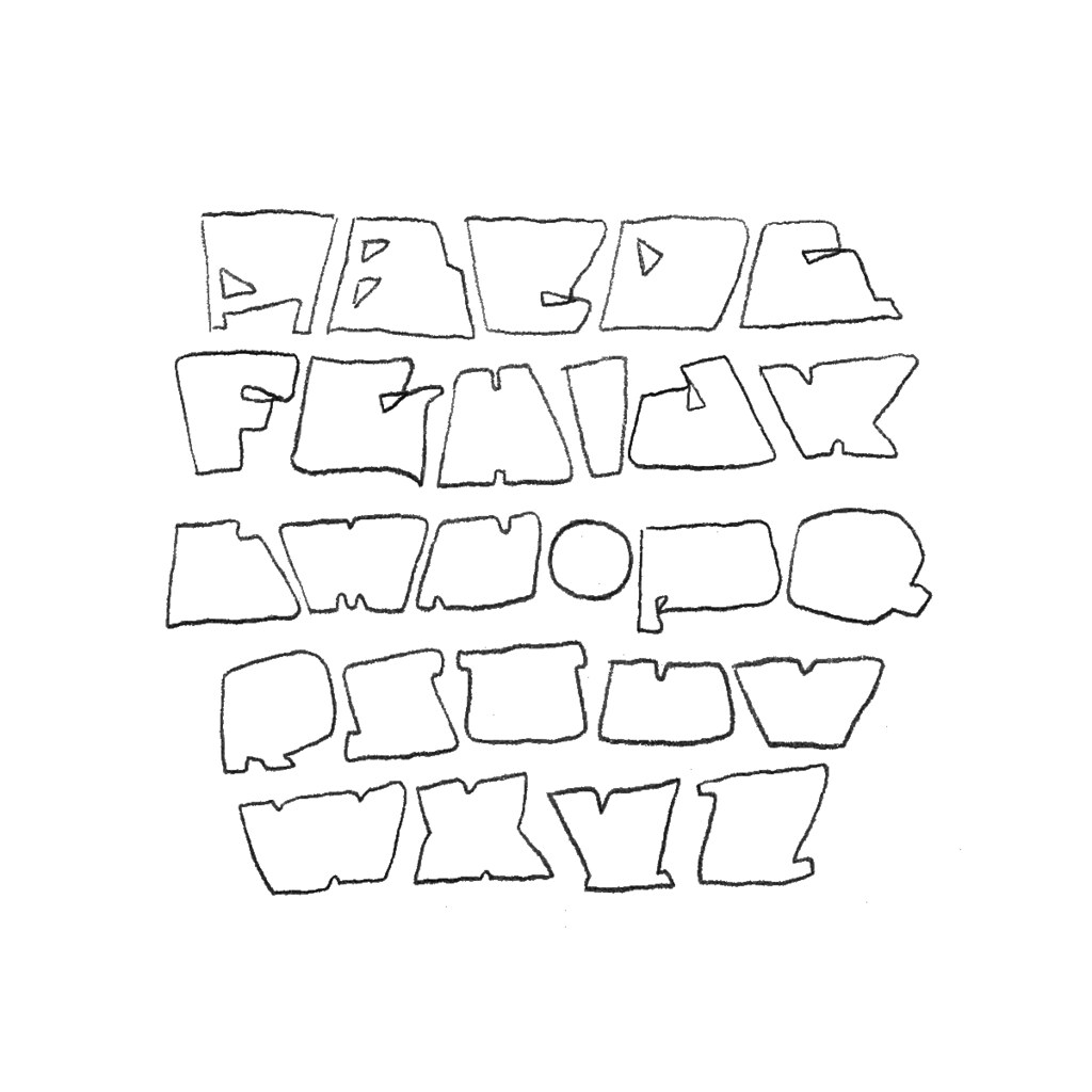
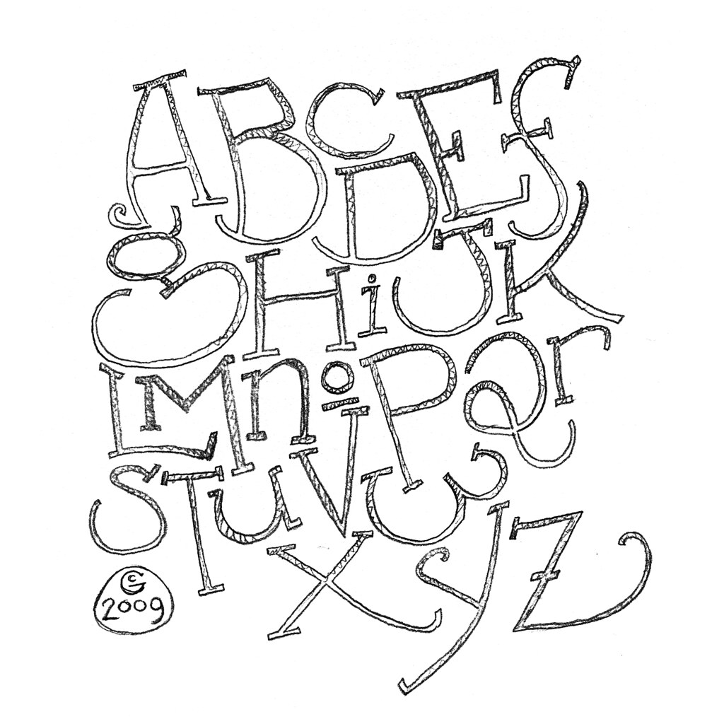
When I'm bored, typically during the life drawing sessions after I've drawn a couple sketches and am no longer inspired to do more from the model, I'll doodle up alphabets and letterforms. Sometimes students are playing music in the rest of the studio space and I'll just draw out a phrase or verse that I'm hearing in the lyrics or whatever is said in conversation.

1. "Coconino Moon" - Named for the way George Herriman always
drew the moon in the old
Krazy Kat comics.

2. "Woog"

3. "Lauderdale"

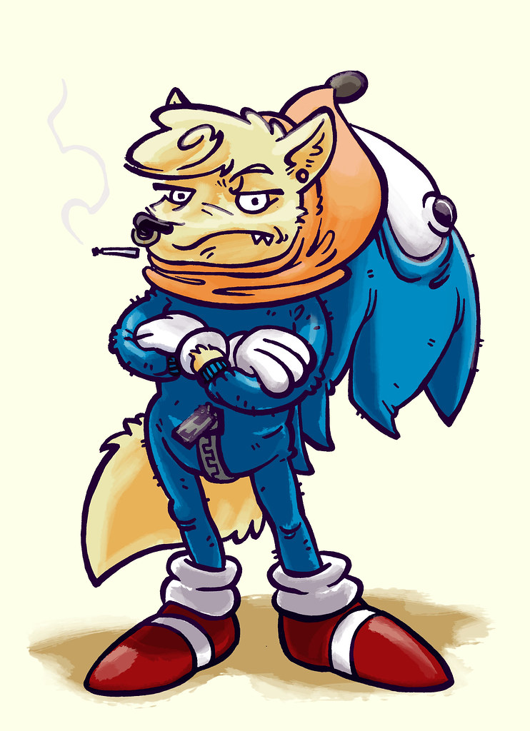
4. "Hooksie" - I was thinking of
Earthworm Jim.

5. "Ploog" - Not the random name it might seem, but named for
Mike Ploog, who did all the design (though clearly after Vaughn Bodé) and such for Ralph Bakshi's esoteric animated opus
Wizards (1977). See it, if you don't know what I'm talking about. Anyway, I had this on my mind at the time.
Drawing letters is fun because they totally have their own gesture, but they aren't real objects, so you don't have to really worry about exactitude or whatever; they are already abstractions. There is enough of a constraint to force creative problem-solving, but open enough as subjects to allow for stress-free, exploratory mark making.
And here's a little random test of the Lauderdale letters as actual type.