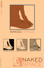
He suggested maybe incorporating a yin-yang thing and/or showing somebody seated in a lotus position.
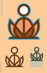
Based on his current logo, I could see that he'd be open to very stylized looks, so I came up with a few different design ideas:


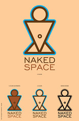
I sent him the designs and he seemed enthusiastic about it. Inspired, he worked more on the project of updating his logo himself, and sent me a sheet of designs he'd come up with based around fitting the current logo figure into the "Golden Ratio" rectangle. He couldn't decide which one to go with and so I picked the one most different from his current logo, but still in keeping with his new design goal. Here is my final submitted design that he approved.

He paid me for my work, but I see on his site that he has tweaked it further still.
NOTE: the website is quite tasteful and presents a respectable business, but there is mild nudity. You can see the design in place here.
He also used the logotype I submitted, and it is a handsome font to be sure.
1 comment:
I love love love the drawn solution! You should definitely pursue that further for your portfolio. It's divine, really.
hope everything is going well!
Post a Comment