Wednesday, March 25, 2009

"Praying Mantis and Golden Scarab"


8.5" x 11". gouache, pencil, over collage.

Sunday, March 22, 2009

"Rabid"


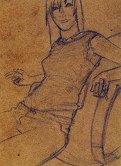
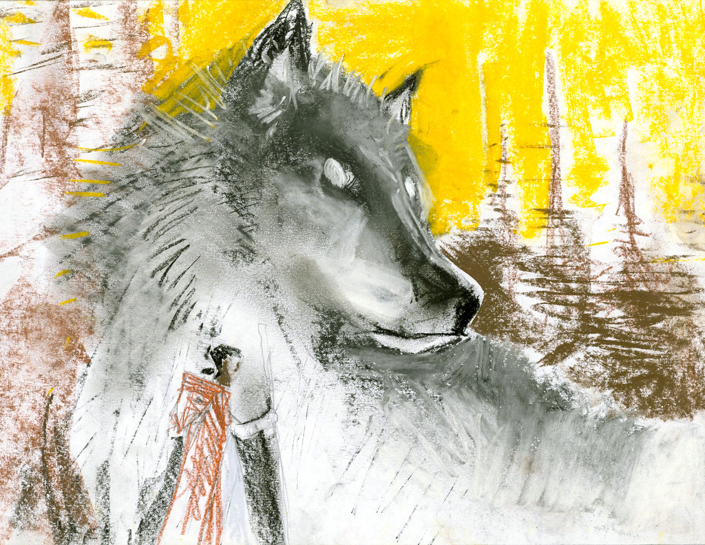
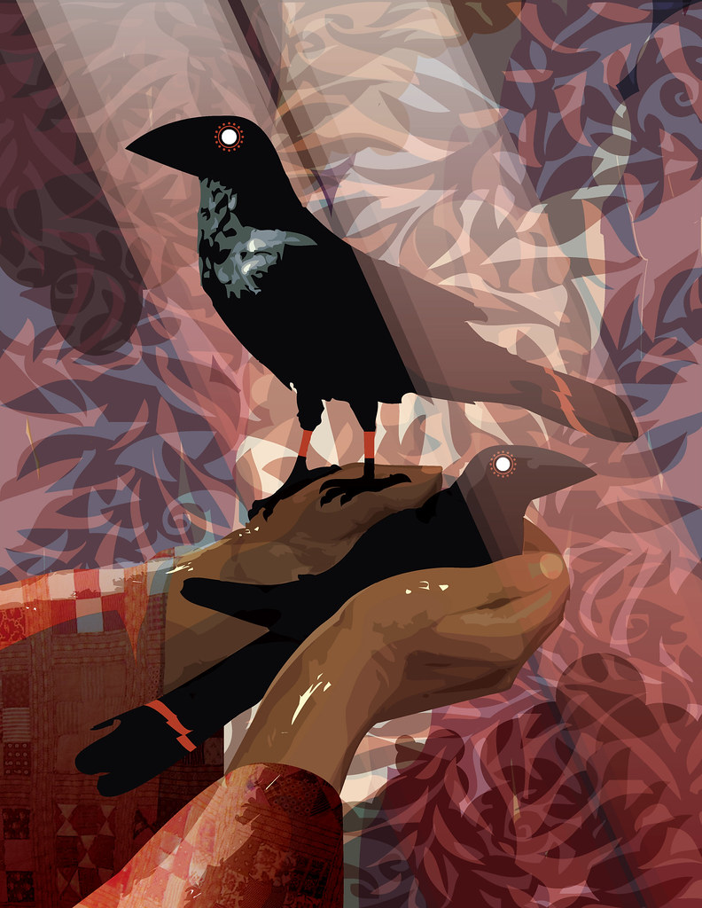
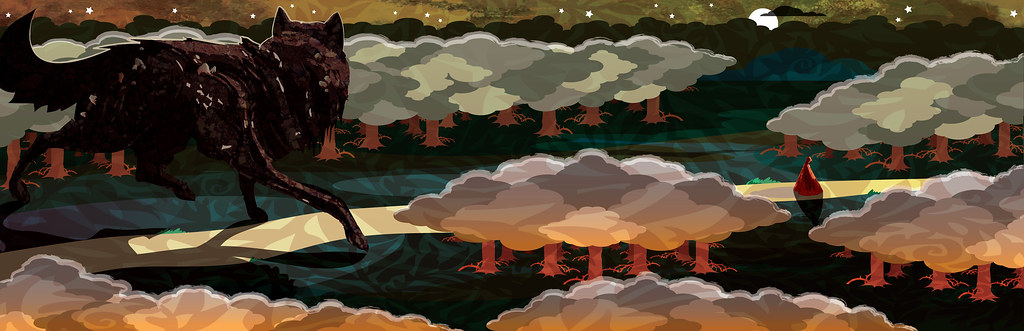
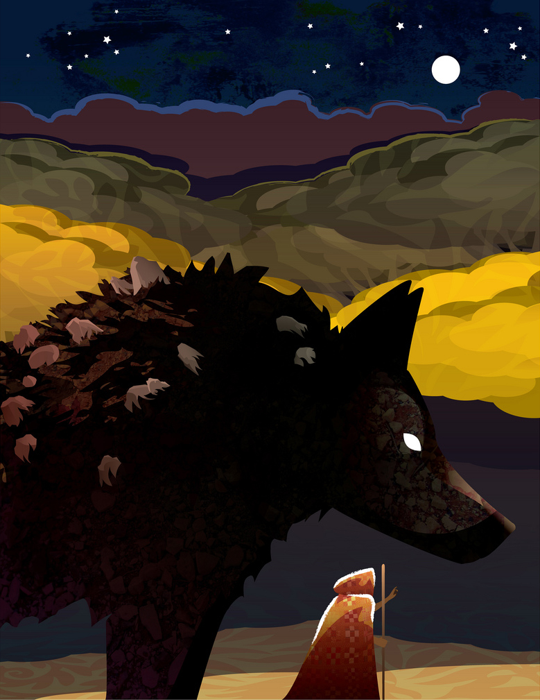
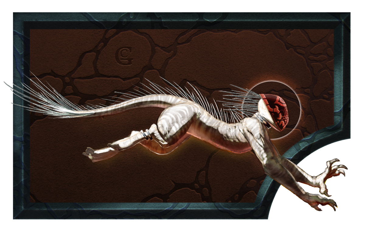
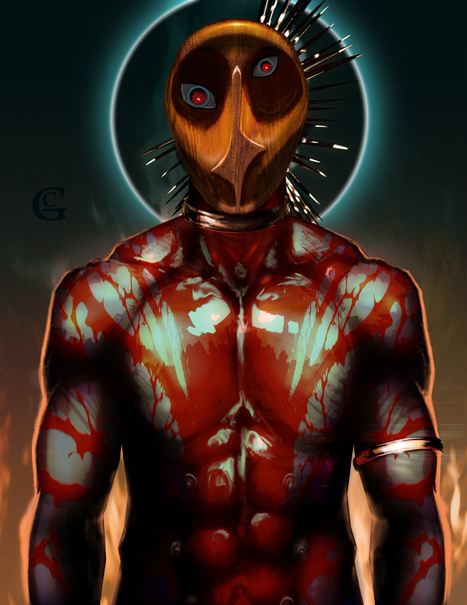
sketch is pencil on 5" x 7" cardboard.
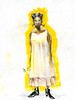
color image is pencil, then digital.

My half of a picture trade. "Rabid" is a nickname. I just work here.

After drawing the pose in pencil onto cardboard, I fully intended to paint it with gouache for the finish. However, I drew this away from my office/studio where I paint, and so, due to insomnia, I just stayed up and finished it digitally instead. I think it would've come out very close to this anyway.

So it goes. The best part is that I still have the raw pencil sketch and could still go ahead and actually paint it later, using this as a guide.

Saturday, March 21, 2009

"The Maiden and the Wolf"


First is the sketchwork and concept/character designs, then the storybook images in sequence. There are some that are just little vignette images that are meant to sit with the text, not stand alone as full page illustrations, etc. Those should be obvious.

The book is available for purchase here via CreateSpace.com

Friday, March 13, 2009

"Grolim the Bully"


ink, then digital.

A simple comic.

Tuesday, March 10, 2009

"Naked Space"

I was recently hired to design a logo for a client that runs a naked yoga studio in NYC called Naked Space. This is pretty much what it sounds like. He wanted something other than the logo he had, which he designed himself and looked like this. I did not alter it in any way other than to convert it to vectors.


He suggested maybe incorporating a yin-yang thing and/or showing somebody seated in a lotus position.

Based on his current logo, I could see that he'd be open to very stylized looks, so I came up with a few different design ideas:

  • A drawn solution:


  • One using the N (from "naked") as part of a yin-yang'ish symbol.


  • A "stickfigure" solution that I wanted to evoke both the seated position and a lotus flower.


    I sent him the designs and he seemed enthusiastic about it. Inspired, he worked more on the project of updating his logo himself, and sent me a sheet of designs he'd come up with based around fitting the current logo figure into the "Golden Ratio" rectangle. He couldn't decide which one to go with and so I picked the one most different from his current logo, but still in keeping with his new design goal. Here is my final submitted design that he approved.


    He paid me for my work, but I see on his site that he has tweaked it further still.

    NOTE: the website is quite tasteful and presents a respectable business, but there is mild nudity. You can see the design in place here.

    He also used the logotype I submitted, and it is a handsome font to be sure.
  • Monday, March 9, 2009

    "La Plaza de Toros de Dis"


    digital.

    ConceptArt.org

    I joined ConceptArt.org and got myself gallery there.

    There is sooooo much awesome work there to see!
    Very inspiring, yes. Also many of the folks there are
    working professionals on cutting edge stuff, so it's
    useful to see what kind of work is getting business
    and how good is "Good" right now.

    I would highly encourage anybody interested in
    illustration or concept art to check it out, since it's
    free to join.

    They have a very active forum as well, with all kinds
    of up to the minute posts on current work and tutorials
    and so on.

    Here's my gallery there.
    And the site's main page.
    And forum.

    "The Island of Dr. Moreau"


    digital.

    A quick sketch image in photoshop and illustrator. The manticore images require a lot of sustained focus, which can be draining. This is much more looser for me, and was a welcome break.

    Tuesday, March 3, 2009

    Sunday, March 1, 2009

    Kit Fantastic Logos


    Logo designs, will try to make a stencil for the star design and apply to a t-shirt.